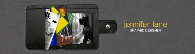
 It's interesting how you can take the same elements and create something totally different!
Thursday, September 17, 2009
GTD Invite #2
It's interesting how you can take the same elements and create something totally different!
Tuesday, September 15, 2009
GTD Banquet Invite
 GTD's banquet theme this year is "New Beginnings" so I decided to go with the whole "planting a seed" idea because GTD essentially is a plant. It needs to be watered, nourished and taken care of in order to thrive in this economic environment. Go ahead, make a donation!


Monday, September 14, 2009
Coffee Label
I calculated the other day and if I'm buying an average of 2 caramel fraps from Starbucks a week, within one year, I've spent $445.12 on coffee alone! Now consider the person that buys one every single day...that equals out to $1112.80 in coffee a year! As I'm drinking it, I'm telling myself it's totally worth it to spend a measley $4.28 each grande cup, until I realize I could have paid off two months of my school loans with my yearly expenditure on coffee, or had a nice shopping spree, or paid almost 15 volleyball tournament fees, or a number of other things that I'm sure are more important than coffee. Starbucks so should charge you less if you don't get whip cream...then maybe I could justify it!
Anyhow, the point of this is that I LOVE coffee. Ask me over 2 years ago and I would have said it was disgusting, but the old adage is true that you "acquire" a taste for it...well, more of an addiction. At the wedding, I've decided to give out little bags of coffee for my favors (because Costa Rica is famous for coffee, get it)?


Tuesday, September 1, 2009
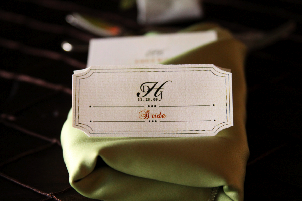
Retro Wedding Invites


Something I've learned over the last 3 months is that the most difficult client to do work for is yourself. But if you push through the bad ideas, frustration and tears, it's a feeling like no other when you can be satisfied with something you design for you. So often, as designers, we focus on making others happy and pleased, but we can be a lot harder on ourselves because we know what we're capable of. I can't tell you how many awful ideas I had before I stumbled across this one. I wanted to do something totally unique for my own wedding invitations, something that would really pull me out of my comfort zone. So I decided to design retro wedding invitations to display characteristics of the 1950's and portray an old love story. The pack included 4 postcards: an invitation, a love letter from Dan to me, a letter from me to Dan and an RSVP. The pack will be tied together with some type of black leather, adorned with some type of pearl and placed in a red envelop that compliments the colors just perfectly. The pictures are compliments of Angela Sackett and Loving Legacy Photography (what a fabulous job)! What a fun collaboration!
St. Pete Christian Volleyball Team Shirt
 Of course, I volunteered to design the team's shirt for this volleyball season, so here it is! Don't tell my girls I'm showing everyone but them, because they would flip! Our theme this year is "in training" and focuses around the idea that not are we only training to be great volleyball players, but that we're training to be more like Christ. "For physical training is of some value, but godliness has value for all things," 1 Tim 4:8. I fell in love with this verse about a year ago and when chatting with the head coach (friend and partner, Lindsey), we both felt drawn to encourage the girls to play for more than just the glory of winning. Our first real practice she told the girls, "Take it from two people that really, really have a love for this sport-there is more to life than volleyball and that is glorifying Christ." What a blessing to work with someone that has such a pure heart!
Hurricanes Collateral


 This is actually a project I did almost two years ago for the Hurricanes club volleyball team I was coaching. It's very rare that I like work that I've done in the past, but I still really enjoy these pieces and have considered updating them and putting them on my website. Though there are definately several things I would change when it comes to the type (oh, the type) and "grunge" look (overdone!), I still like the overall layout and idea. There is a biz card, the inside and outside of a brochure, a letterhead and a warm-up jersey. There's something striking about the colors, I can't explain it!
Subscribe to:
Posts (Atom)